

The Facelift Era of Brand Identity Is Here.
No logo has stayed the same since the 1950s. Not one.
Coca-Cola has refined its wordmark dozens of times. Nike has adjusted its swoosh. IBM has evolved its stripe system. Apple went from a rainbow to a monochrome and never looked back. These are not rebrands. They are the natural, ongoing evolution of a visual identity keeping pace with the company behind it.
This is not a modern phenomenon. It is centuries old. Brands that have endured have done so precisely because they understood that a visual identity is not a monument. It is a living system. And living systems grow.
The businesses that treat their brand as a fixed artifact, something designed once and never touched, are not honoring their identity. They are freezing it. And frozen things don't stay fresh. They decay.
A Brand That Doesn't Evolve Loses Its Audience
Here is what actually happens when a brand refuses to move.
The product improves. The team grows. The culture shifts. The company becomes something richer, more sophisticated, more capable than it was when it launched. But the visual identity stays exactly where it was on day one. And slowly, almost imperceptibly, a gap opens up between what the brand looks like and what the brand actually is.
Customers feel that gap before they can name it. They start to sense that something is slightly off, that the packaging doesn't match the product, that the logo feels like it belongs to an earlier version of the company. Trust erodes quietly. Attention drifts.
A brand refresh closes that gap. It brings the outside in line with the inside. It says to customers: we are still here, we are still us, and we have grown. That continuity is what keeps audiences engaged across years and decades. It is what turns customers into loyalists and loyalists into advocates.
A Brand That Doesn't Evolve Loses Its Audience
Here is what actually happens when a brand refuses to move.
The product improves. The team grows. The culture shifts. The company becomes something richer, more sophisticated, more capable than it was when it launched. But the visual identity stays exactly where it was on day one. And slowly, almost imperceptibly, a gap opens up between what the brand looks like and what the brand actually is.
Customers feel that gap before they can name it. They start to sense that something is slightly off, that the packaging doesn't match the product, that the logo feels like it belongs to an earlier version of the company. Trust erodes quietly. Attention drifts.
A brand refresh closes that gap. It brings the outside in line with the inside. It says to customers: we are still here, we are still us, and we have grown. That continuity is what keeps audiences engaged across years and decades. It is what turns customers into loyalists and loyalists into advocates.
The Brands Doing It Right
Loewe
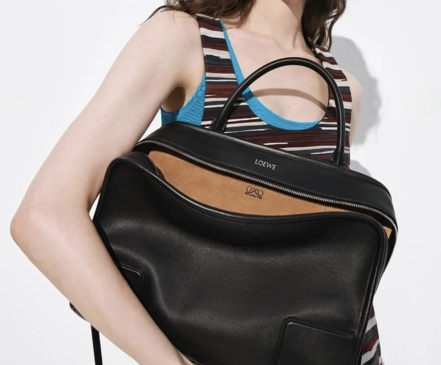
In January 2026, Loewe did something that most 180-year-old luxury houses wouldn't dare. It simplified.
Incoming creative directors Jack McCollough and Lazaro Hernandez retired the brand's iconic four-pronged anagram logo in favor of a cleaner, more minimal double-L mark. On the surface it looks like a small typographic decision. Strategically it is a significant one. The new mark signals a deliberate shift toward what the brand is calling "Elevated Utility" and "Sophisticated Streetwear", a repositioning that acknowledges where luxury consumers are heading without abandoning the heritage that makes Loewe worth following there.
This is a textbook refresh. The brand didn't become something else. It became a sharper version of itself, built for where culture is going rather than where it has been. Nearly two centuries of equity, carried forward into a mark that feels completely of the moment.
Burberry
Burberry's evolution happened twice, and both times it was driven by the same principle: the brand had grown in a direction the visual identity no longer reflected. In the early 2000s, the iconic check had drifted far from its origins. The decade-long refresh that followed, pulling back the check, elevating the trench coat, tightening the visual language around British heritage and craft, was the brand catching up to where it needed to be. When Daniel Lee introduced a new logo in 2023, it didn't feel like a departure. It felt like the next logical step in a company that had been evolving deliberately for years.
Domino's
Domino's is the most underrated brand evolution story of the past two decades. The company publicly acknowledged that its product had fallen behind its own standards, overhauled the recipe, simplified the logo, and dropped "Pizza" from the name entirely, signaling that the brand had grown into something larger than a single product category. The visual refresh followed the business evolution. It didn't lead it. That alignment between what the company was becoming and how it presented itself drove one of the most remarkable commercial turnarounds in modern history. Domino's stock went from around $3 in 2008 to over $400 at its peak.
Airbnb
When Airbnb introduced the Bélo symbol in 2014, it wasn't starting over. It was finally giving visual form to something the company had always stood for but never been able to articulate in a single mark. The brand had grown from a scrappy startup into a global platform representing belonging across cultures and languages. The identity needed to grow with it. In the years since, Airbnb has continued refining its visual system so gradually that most users never registered the changes consciously. They just felt increasingly at home with the brand. That feeling is not accidental. It is the result of consistent, intentional evolution.
Jaguar
Jaguar's 2024 rebrand is instructive for the opposite reason. The brand moved so far from its established visual equity so quickly that the continuity was lost entirely. The audience couldn't find themselves in the new identity. The lesson is not that change is wrong. It's that evolution works best when it keeps the thread visible, when customers can feel the connection between where the brand was and where it is going, even if they can't articulate exactly what changed.

On Touching Another Designer's Work
Almost every brand identity you admire has been shaped by more than one designer. Multiple hands, multiple eras, multiple interpretations of the same core idea.
That is not a compromise. That is how enduring visual identities are built.
A logo designed in 1995 was designed for print, for television, for a world before smartphones and social media. It was a starting point, not a final answer. Refining that work, tightening a letterform, updating a typeface for digital legibility, adjusting a color for screen accuracy, is not a betrayal of the original vision. It is the continuation of it.
Treating a brand identity as untouchable because someone else created it doesn't produce something timeless. It produces something frozen. And the companies whose brands have lasted longest are the ones who understood that stewardship of a visual identity means tending to it, not protecting it from change.
The Bottom Line
Change is not a risk to your brand. Stagnation is.
The companies that have stayed relevant across decades, across generations, across entirely new cultural landscapes, are the ones that understood this. They evolved their visual identity the way a person evolves their sense of self. Deliberately. Continuously. Always in service of who they are becoming, not just who they were.
No logo has stayed the same since the 1950s. The brands you love most are proof that evolution and identity are not opposites. They are the same thing.
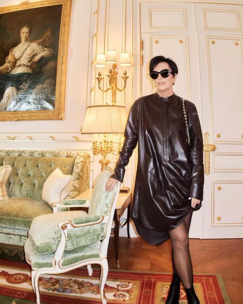
Even Kris Jenner knows when it's time for an update. Your brand should too.
